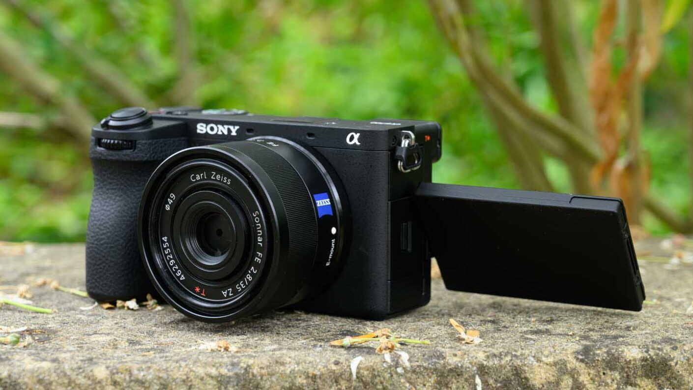
If you take a quick glance at the Sony A6700, you’re likely to think that it looks the same as its predecessor, the A6600, as it has the familiar compact, flat-topped rectangular shape and a similar control layout. However, there are a few noteworthy changes.
According to Sony, the A6700’s grip is more ergonomically shaped than the A6600’s, but I can’t say I noticed a major change. On the back of the camera, in the top-right corner, the A6700 has a small but effective thumb rest. In combination with the front grip, this makes the camera feel secure in my hand.
It’s reassuring to know that the A6700 is made from magnesium alloy and is sealed against dust and moisture, but Sony hasn’t stated to what level.
As with the A6600, there’s just enough space on the Sony A6700’s grip to squeeze on three fingers while my index finger is on the shutter release or hovering near the record button. However, when I’m shooting, I tend to slip my little finger under the grip because I find it easier to keep the camera steady.
I used the A6700 with a range of lenses, including the full-frame FE 70-200mm F2.8 GM OSS (effective focal length 105-300mm) mounted with the Sony 2x teleconverter to give an effective focal length range of 210-600mm. While that’s a front-heavy set-up, it’s perfectly usable with the camera’s grip giving the purchase required to keep the lens steady when your left hand gives some support. That said, the APS-C format Sony E 70-350mm F4.5-6.3 G OSS, which has an effective focal of 105-525mm is a better match.
There are a few control changes introduced by the A6700 that have a positive impact. Rather than having the video option on the mode dial, for instance, there’s a dial beneath the exposure mode dial that can be set to stills, video or S&Q (slow and quick) mode. That’s great because it means you can shoot video in whichever exposure mode you have selected via the mode dial rather than having to set it via the menu.
In addition, the place taken by the video record button on the A6600 is now occupied by the c1 custom button, and by default, the record button is much more sensibly located on the top plate of the camera, just back from the shutter release. That’s a straight swap for the c1 button on the A6600. This means the record button is easier to press without wobbling the camera at the start and end of every video clip.
Thanks to a ridge between the c2 and record buttons, the two buttons are easy to locate with your finger and press when you’re looking through the viewfinder. Without that ridge, they would be difficult to find without looking.
One control that is on the A6600 that some may miss on the A6700 is the AF/MF switch. In some cases, this isn’t needed because many lenses have the same switch, but otherwise, you’ll have to change between manual focus and autofocus (AF) mode using the function (Fn) menu. Given the excellent performance of the A6700’s AF system, this isn’t a major issue.
One disappointment with the Sony A6700 is that it doesn’t have a joystick for selecting the AF point. Instead, there are two options available for setting the point. The first is to press the button at the centre of the navigation pad on the back of the camera to activate AF point selection mode and then use the navigation control to move the point around. Conveniently, this option stays active until the centre button is pressed again, but it’s a pain to have to keep pressing it to revert back to access the navigation control shortcut options.
Alternatively, activating the TouchPad allows the screen to be used to set the AF point by a touch control on the screen. I like to set this to use the bottom right quarter of the screen as this avoids me setting the point with my nose and also makes it easy to set the AF point using my right thumb.
I prefer to set the Touch Position mode to ‘Relative’ as this prevents the AF point from jumping straight to wherever I touch the screen and allows me to move it up or down, left or right, relative to its starting point. It is a more intuitive way of working when I’m only using a small part of the screen to set the AF point and I’m looking in the viewfinder.
Helpfully, when you take your eye away from the viewfinder and compose images or video on the screen, the camera defaults to using the whole screen with Absolute Position, so the AF point jumps quickly to wherever you tap.
Sony A6700 screen
The screen on the Sony A6700 makes two of the most welcome changes in comparison with the A6600. As well as making a modest step up in resolution from 921,600 dots to 1.03-million dots, the 3-inch screen on the A6700 is mounted on a vari-angle hinge. This means that the screen can be flipped and rotated up or down, making it of use whether you’re shooting in landscape or portrait orientation. It can also be rotated to face forwards for vlogging.
In further good news, Sony has made much more use of the screen’s touch sensitivity. Consequently, in addition to being able to use the screen to trip the shutter or select the focus or tracking point, the A6700’s touch control extends to the main and function (Fn) menus. You can even access the Fn menu by swiping up, and then it’s just a question of tapping on the parameter you want to adjust before selecting the option you want.
Sony hasn’t extended the touch control at the expense of button and dial control; the A6700 still has all the buttons and dials that you’d expect – albeit without the AF/MF switched I mentioned earlier.
Following in the footsteps of the Sony A7S III, Sony A1, Sony A7 IV and Sony A7R V, the A6700 has a revised menu that makes it easier to find the options that you want. This includes a two-page ‘Main’ section that lays out the key settings in a grid ready for selection with a tap. As I mentioned earlier, the whole menu is navigable by touch, which makes finding, selecting and adjusting the parameters you want much quicker than with physical buttons and dials – although they are also available.
It’s good to see that the default options in the function menu are different in stills and video mode. It means you see features that are more relativist to what you’re shooting.
Sony A6700 viewfinder
There are no changes to report with the Sony A6700’s viewfinder as it remains the same as the A6600. It’s a 0.39-inch type OLED with 2,359,000 dots. The 0.39-inch type viewfinder is significantly smaller than the 0.5-inch 3.69-million-dot EVF in the Fujifilm X-T5 and some other cameras. If you wear spectacles, it’s unlikely you’ll get your eye close enough to exclude the surrounding view, and I found it preferable to shoot without my glasses, either adjusting the diopter or wearing contact lenses.
The viewfinder can be set to ‘Standard’ or ‘High’ quality and ‘High’ or ‘Standard’ frame rate. However, you can’t set both to ‘High’, one has to be in the ‘Standard’ setting. I found the ‘Standard’ quality setting fine for most instances, but there’s a bit more detail visible when the ‘High’ setting is selected, and that could be helpful for macro photography or those times when you need to know that you’ve got the focus in precisely the right place. It also gives a better view in low light at high ISO settings, as the shadows look cleaner.
The ‘High’ frame rate option is a better choice with moving subjects, but I was still able to follow animals and the like satisfactorily in the Standard mode.
While the viewfinder is small in comparison with some of the competition, it gives an accurate preview of the images so you can use it to assess colour, white balance and exposure.


